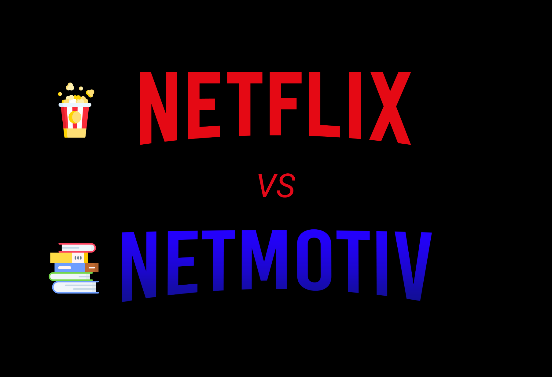
Netflix vs NetMotiv
Year: 2020
Client (fictive): Netflix
Template: mobile application
Duration: 6 days
Role: UX/UI Designer
I have to chose a fictive client for this project, I decided to go with Netflix because I use it daily and love the design of the mobile application. Netflix precursor of streaming video on the market is trying to adapt every year it's platform to users to surprise them. The UX design to catalogue videos, classify by genre, notoriety, everything is designed to meet the demands of a chameleon target and change over the years user experience.
The purpose of this project was to add a feature to an existing mobile application. The brief was to make students watch less Netflix during their exam period.
Difficult to influence people to less watch Netflix - Netflix has strong notoriety and has strong communication online - Nowadays almost all students have a phone and access to applications. Deconcentration of work due to mobile networks and applications is a real problem - New content every month, with notifications of new content alerts
Customized - Friendly - Educative

I selected 3 direct competitors during my secondary research, Prime Video, Disney + and OCS.
All of these competitors are proposing a streaming platform and downloading videos in your personal account.
Prime video is one the most important direct competitor to Netflix. The streaming platform has the rights to many films as well and has almost the same design for categorization, downloading, personal account. By subscribing to Prime video the user has also access to others services provided by Amazon.
Disney + is offering Disney, Pixar, Marvel, Star Wars, National Geographic and more streaming videos. In France you can subscribe to it through Canal Plus with annual or monthly fixed prices.
OCS unlike Disney Plus and Prime video is only available in France and is proposed by the phone operator Orange with monthly subscriptions. Like other platforms the user can stream videos and download it.
For indirect competitors I chose Youtube, PUBG mobile and TV Time.
Only Youtube is proposing streaming videos but all of these competitors are targetting same people and are offering service related to streaming. None of them allow you to download videos but you can create a personal account on each mobile application.
I decided to insert PUBG in my research because it is one of the most famous mobile game this year and a lot of student spend their time on this application instead watching Netflix.
TV Time allows the user to know where he is in terms of his series and films, it's like a TO DO for movies and series to watch. The user can create a private profile, this service is also provided by Netflix, users on netflix can remind where they stopped their movie or serie.

Netflix has a high level of customized profile and digitalized content with the most extensive library, but it is one of the most expensive applications, instead of 3 indirect competitors which are free. Other direct competitors are closed to Netflix and improve platform design and services over the years.
Netflix: 8M of subscribers in France
Prime Video: 7M of subscribers in France
Disney+: about 5M of subscribers in France
OCS: 3M of subscribers in France
I interviewed 4 students and 1 recent graduate. The interviews were very important in this project, thanks to them I was able to modify the initial brief to better meet the expectations of the users.
After interviewed users I realized that stop them watching Netflix will be complicated because they would feel oppressed and lose their freedom of action on the application. I observed that we needed to help students manage their connectivity time better rather than forcing them to reduce their time spent watching Netflix.
People will be interested by a feature to help them to manage their connectivity, but according to comment the feature has to follow several points:
I will follow my project with the problem statement "A feature that helps students to manage their study/ chill time on Netflix and focus on their exam, through an educational and digitale platform.".
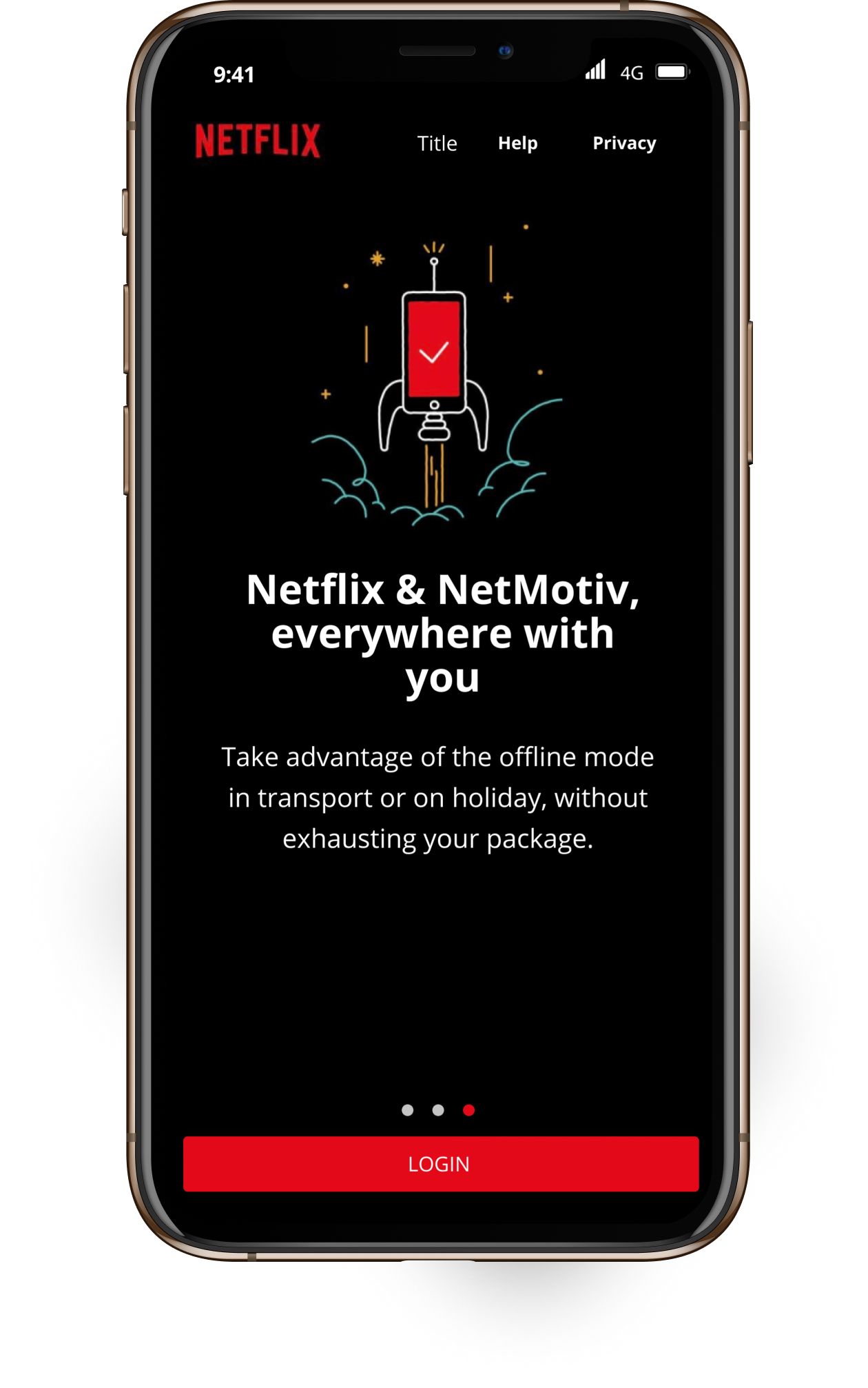
Most of interviewed people told me that there are a large choice of contents on Netflix that can distract them from studies so I decided to think of a way to add more educative contents instead of delete contents. They can't stop to navigate on their phone and mobile applications and have to keep their freedom on Netflix. To let users having the possibility to choose contents and manage their connectivity time with studies I will create a parallel plateforme called Netmotiv and available via Netflix mobile application.
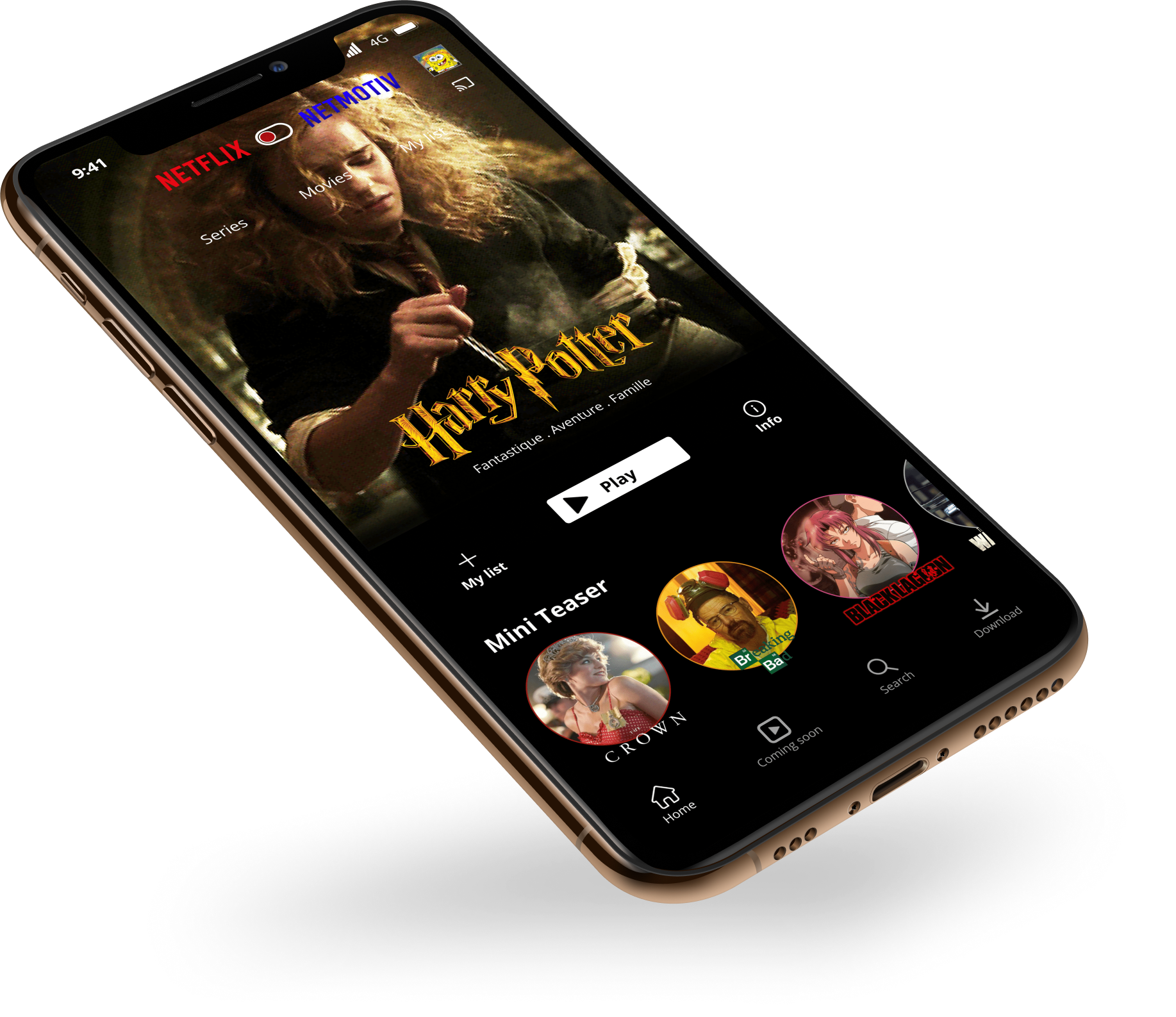
The student will be able to switch from one platform to another through a specific step and radio button.
On this new platform, educational and learning contents will be available, presented with same design and categories as Netflix ➯It is important to not lose the student and prompt the user to discover this feature
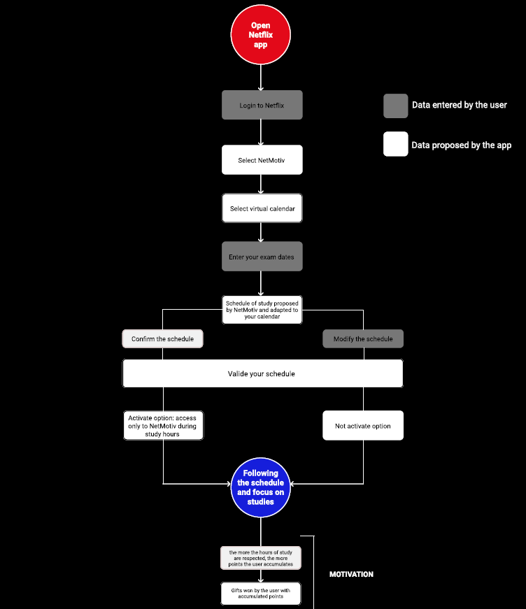
The addition of a virtual calendar is necessary ➯This calendar allows students to select their exam dates.
According to selected dates NetMotiv will propose a study schedule to the user ➯the user can modify it at any time.
After all these steps, students can active or not a specific option if they want to go deeper into its exam focus and stop watching Netflix platform.
Option: possibility for students to block Netflix access during studies hours and promote connectivity on Netmotiv. (possibility to active or desactive this option at any moment)
Motivation: If students are following well their connectivity planning during period exam they are winning discount code for partner brands thanks to virtual points on the platform Netmotiv.

I presented my mid-fi to the interviewees trying to notice if they could navigate fluently through my feature. I was able to highlight on each stage the points to be modified in terms of design, navigation or understanding.
According to their comments I modify some buttons design, access to Netmotiv, planning design which was too far from Netflix architecture, some text button or notifications.
After collecting all comments I changed all negative points to obtain a feature which looks naturally included in Netflix application. I wanted something smooth with clear and easy navigation for students but with nice and trendy design.
All interviewees were pleasantly surprised and loved the functionality, they keep their freedom to choose whether or not they want to have less access to Netflix. To stay on Netflix mobile application to have access to NetMotiv is a good way to encourage students to move more towards educational contents. I observed that you can get people to use a less entertaining programme if the motivation is right and the user experience is well defined.
.png)
.png)
.png)